Article: Colour Trends for Apparel: A Decorator’s Guide
Colour Trends for Apparel: A Decorator’s Guide
Color trends aren’t just for interiors—they shape what customers want to wear. For 2026, several paint brands point to grounded neutrals, nature-inspired greens, heritage ochres, confident reds, and versatile blues. Here’s how to turn those tones into reliable, brandable apparel ranges that decorate cleanly and sell through.
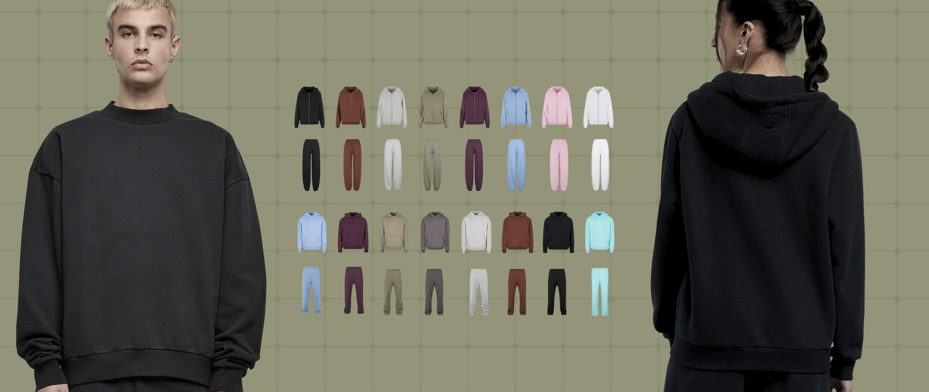
The 2026 palette at a glance
-
Warm grounded neutral: Sherwin-Williams’ Universal Khaki (SW 6150)—an understated, timeless tan that pairs easily across palettes.
-
Nature-led green: Valspar’s Warm Eucalyptus—an earthy green positioned as a “new neutral.”
-
Soft heritage ochre: C2’s Epernay—a refined, mineral-washed ochre with quiet luxury vibes.
-
Rich classic red: Glidden/PPG’s Warm Mahogany—a deep, inviting red with a premium feel.
-
Confident blues: Dulux’s 2026 family highlights indigo-leaning blues, versatile for base or accent.
How to turn trends into apparel that decorates well
1) Pick blank colors that work with your decoration method
-
Screen print: Khaki, eucalyptus, and ochre take solid spot colors and tone-on-tone inks beautifully. On reds or deep blues, use low-bleed or blocker bases on poly-rich blends and confirm cure temps to control migration.
-
DTG: Cotton-rich fleece and jersey in khaki/green/ochre deliver smooth prints—pre-treat consistently and test on brushed back fabrics.
-
DTF & transfers: Great on dark reds and blues where detail and color accuracy matter; keep press temps/times logged for repeatability.
-
Embroidery: Use a cut-away backing on fleece; add water-soluble topping to stop stitches sinking. Metallic or matte threads both pair well with ochre and khaki; for eucalyptus, deep charcoal or bone thread reads premium.
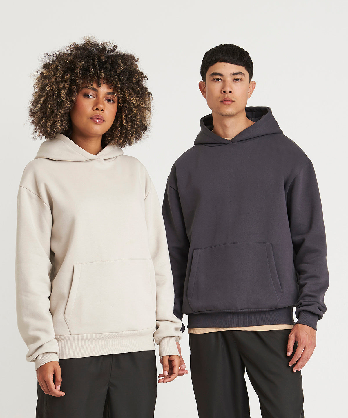
2) Build “capsules” around a lead neutral
Start with Universal Khaki–style neutrals for hoodies, crews, tees, and joggers, then layer accent drops in eucalyptus green or heritage ochre. Neutrals protect long-term stock; accents let you chase trend without replacing core inventory.
3) Use contrast the right way
-
On khaki/ochre, white, bone, or cream inks feel modern; black yields high contrast for logos.
-
On eucalyptus, try tone-on-tone embroidery (one or two shades darker) for an elevated uniform look.
-
On deep reds/blues, consider matte finishes or puff highlights to add depth without clashing.
4) Standardize specs for repeat orders
Document ink sets, thread codes, underbases, press temps, placements, and hooping per color. It safeguards consistency when replenishing core sizes and when you add seasonal accents.
Product planning by color family
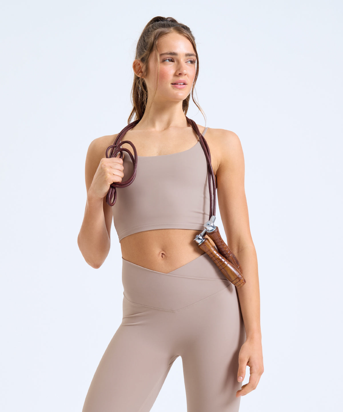
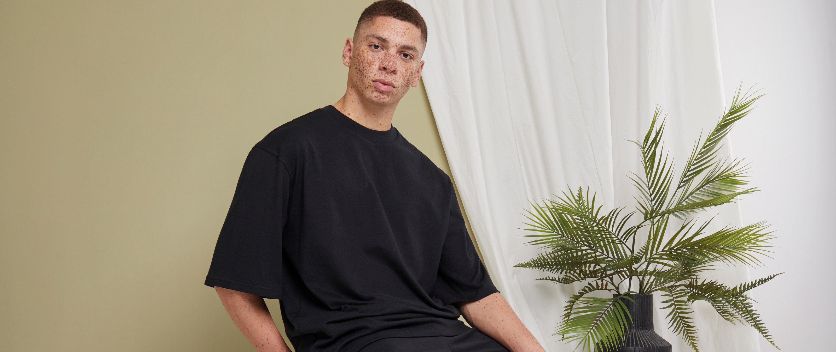
Grounded neutrals (Khaki/Taupe)
-
Where to use: Full uniform programs, corporate kits, premium merch basics.
-
Decoration notes: Excellent for minimal logos, tone-on-tone prints, and subtle chest embroidery. Works across cotton and cotton–poly.
Nature greens (Warm Eucalyptus)
-
Where to use: Teamwear and lifestyle merch; reads fresh without being loud.
-
Decoration notes: DTF for fine detail, screen prints for bold branding; charcoal, ecru, or antique gold threads look refined.
Soft heritage ochre (Epernay)
-
Where to use: Retail-style capsules and collabs; pairs with ecru, brown, and black accessories.
-
Decoration notes: White ink pops cleanly; matte gold thread for crest embroidery adds “quiet luxury.”
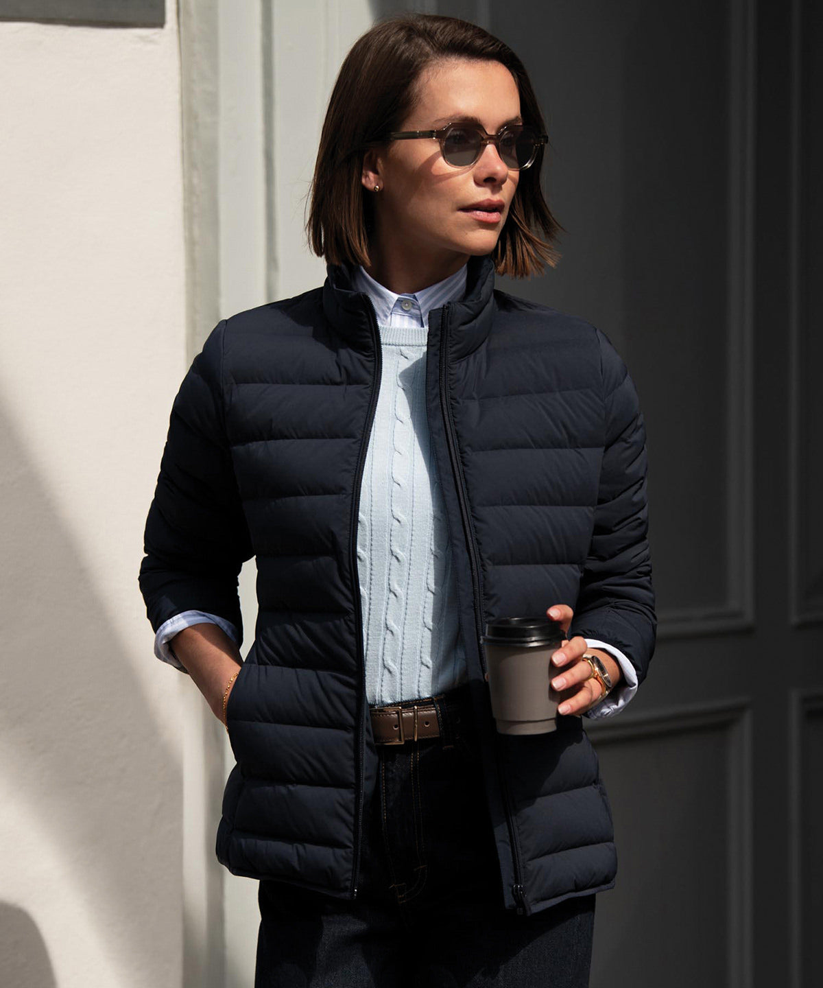
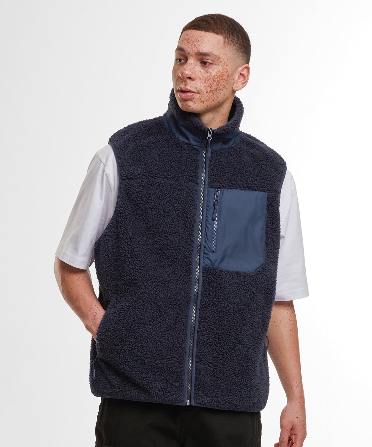
Confident blues
-
Where to use: Event kits and outdoor uniforms needing visibility with polish.
-
Decoration notes: High-opacity whites and reflective transfers perform well; navy-to-indigo ranges keep branding professional.
Rich classic reds (Warm Mahogany)
-
Where to use: Limited drops, heritage-leaning merch, seasonal capsules.
-
Decoration notes: Use a blocker base on poly blends; antique gold thread or bone ink delivers premium contrast.
Sizing, fits, and placements that sell
-
Fits: Offer a regular and an oversized silhouette per color to cover corporate and streetwear use-cases with one palette.
-
Placements: Chest left for logos; sleeves or thigh/calf for secondary marks; avoid heavy fills across pocket bags/zip channels on fleece.
-
Testing: Always run print/embroidery + wash tests (at 30–40 °C) before scaling.
Buying checklist for trade customers
-
Choose a lead neutral (khaki/taupe) + 1–2 accent colors (eucalyptus/ochre/blue/red).
-
Confirm fabric mix vs. decoration method (cotton-rich for DTG; poly/cotton for versatile screen/DTF; stable fleece for embroidery).
-
Lock thread/ink codes and press/hooping settings for reorders.
-
Stock core sizes deep in neutrals; use accents for seasonal or campaign stories.
-
Create visuals: mockups showing tone-on-tone and high-contrast options help clients buy faster.


